Cartiere Fedrigoni, Verona (I)

Image and photo credits: Fedrigoni Germany
Our work for the German subsidiary of the Verona-based fine paper manufacturer is one of the highlights in terms of creative design with artistic merit. For over ten years, we have been developing insert and advertising campaigns, sales promotion strategies, and event concepts – as detailed in the w&v article.
“Creating World's Classics” Campaign
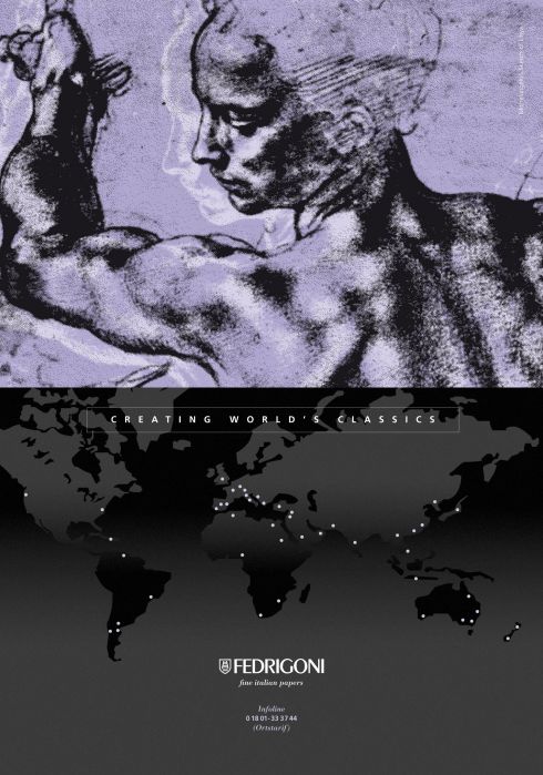
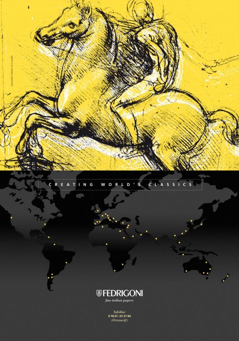
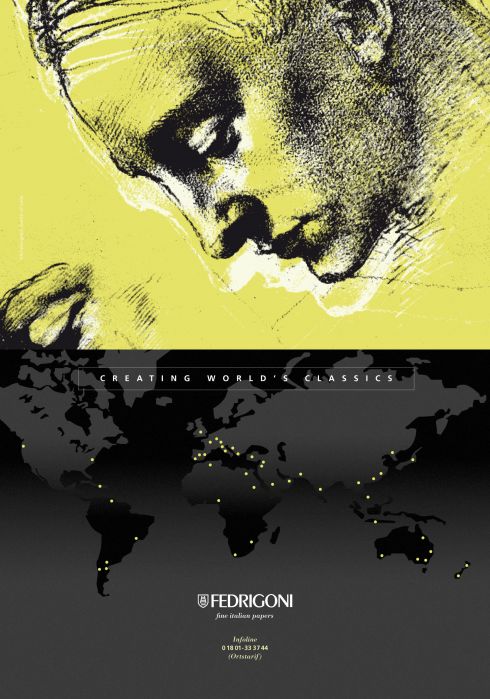
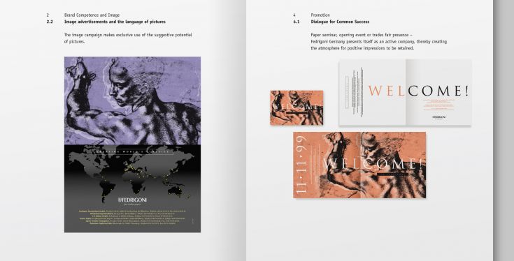
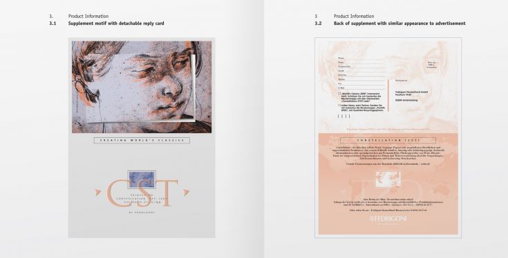
We typically update our campaign theme and communication design every two years. The concept distinguishes three strategic areas that work synergistically but each address different areas of perception – first: brand competence and image; second: product information; and third: promotion. The image campaigns aimed at strengthening brand competence rely almost exclusively on the evocative power of imagery, each combined with catchy slogans (see excerpts below).
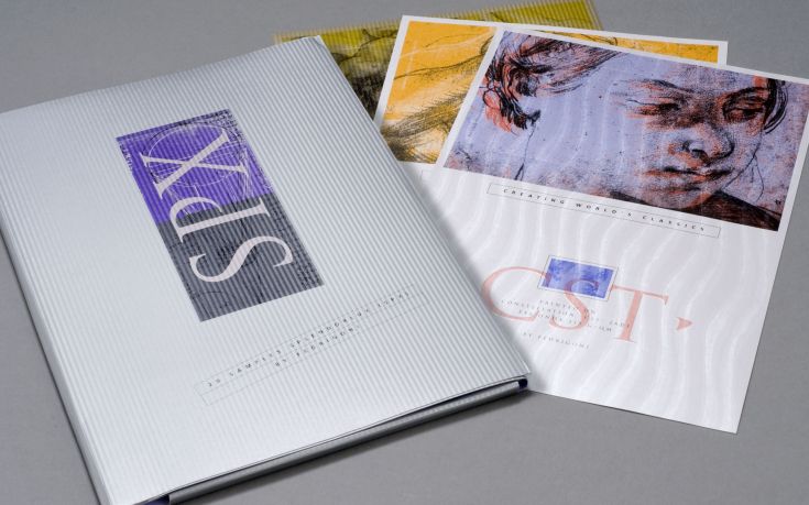
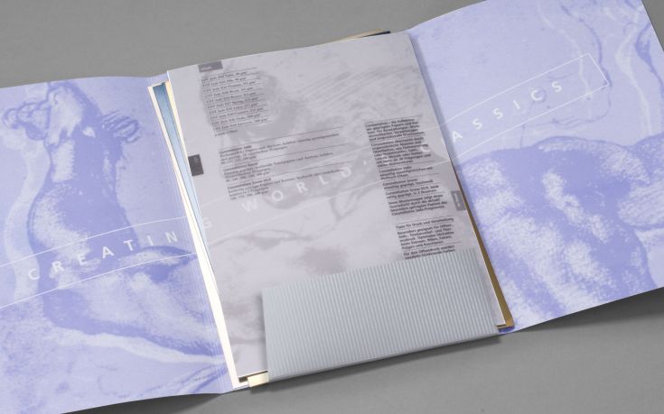
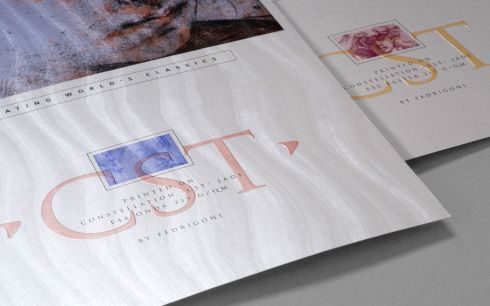
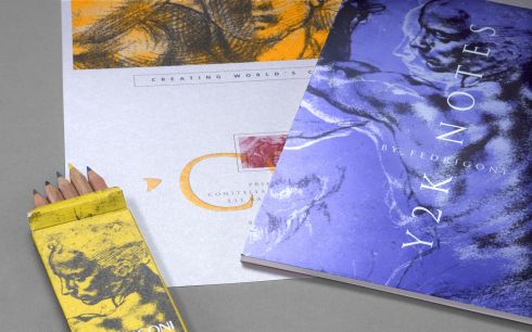
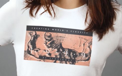
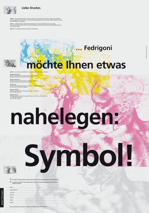
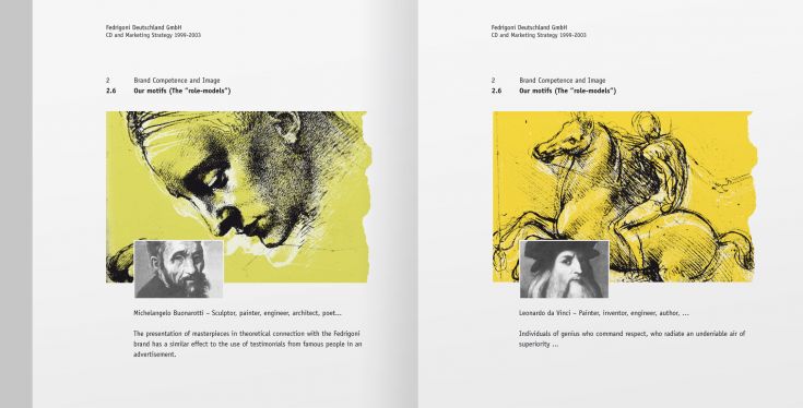
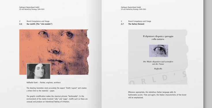
The “Classics” advertising campaign showcases the company’s strength and stature – a striking corporate design with Italian flair. Sketches by famous Renaissance geniuses document an Italian cultural achievement that has shaped the world. The presentation of masterful works in conceptual connection with the Fedrigoni brand builds trust in much the same way as testimonial advertising featuring celebrities. We apply the strong key visuals to posters, inserts, advertisements, T-shirts, and giveaways.
“Papercult” Campaign
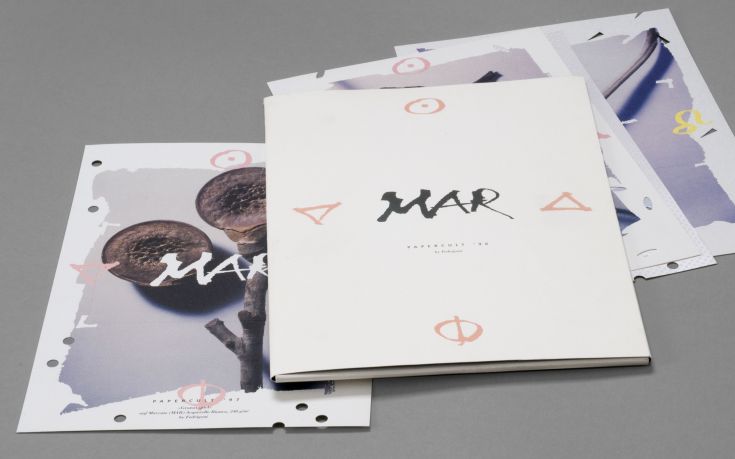
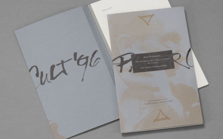
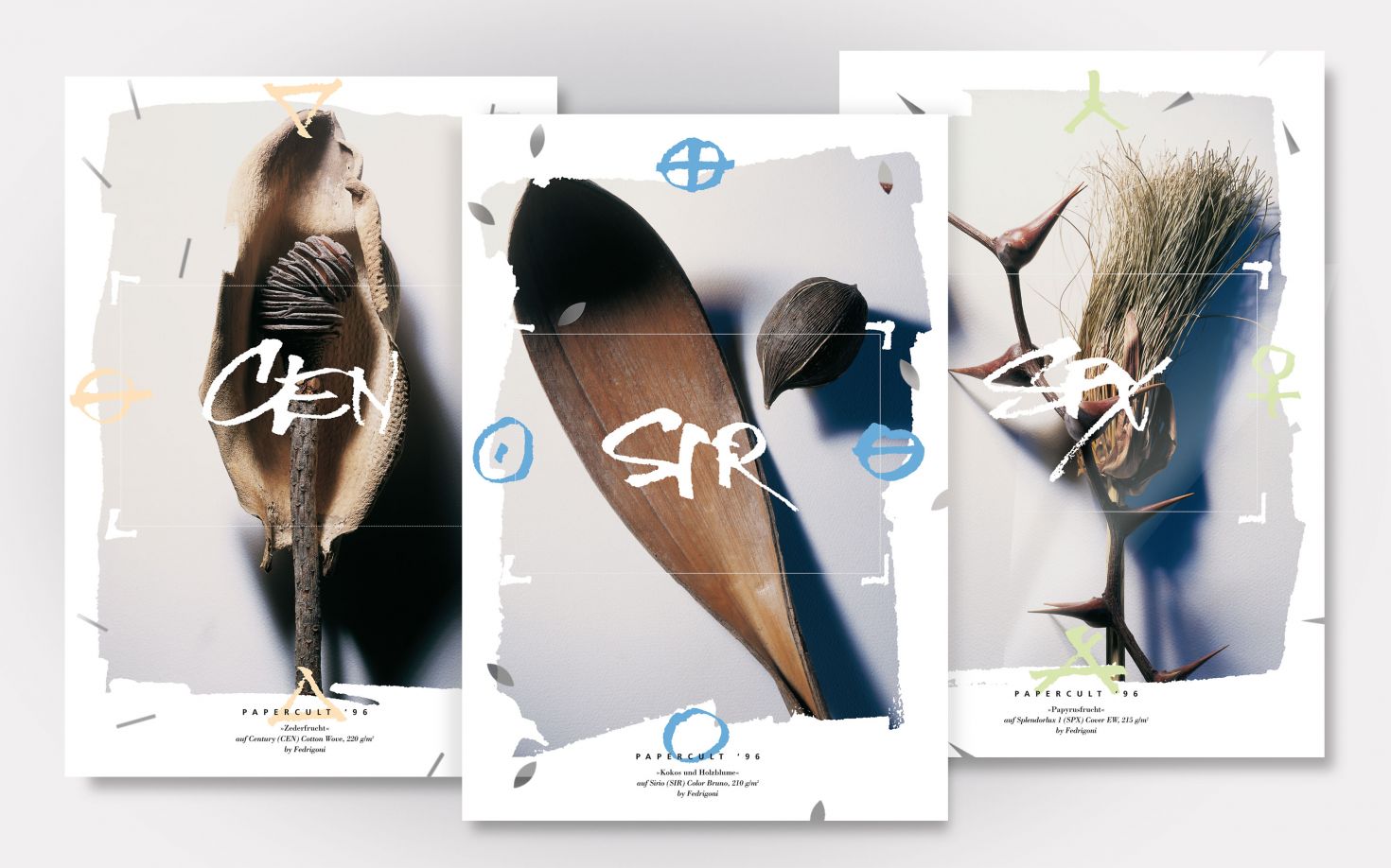
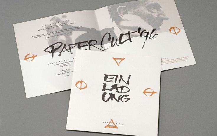
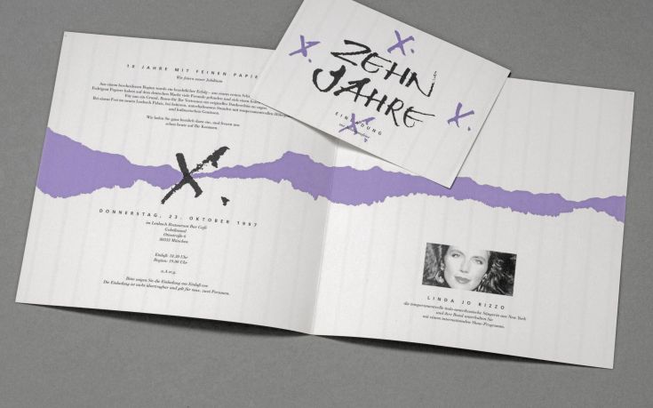
“Papercult” Campaign Photography: on behalf of Fedrigoni Germany, Unterhaching · Calligraphy: H. Egerer, Munich
Rituals in arts and cult serve as the inspiration for this distinctive visual style, which stands out primarily due to its intricate die-cuts. The product’s tactile quality, its surfaces, and material properties take center stage. The “perforated” pattern was initially met with skepticism by the client, but in trade publications, the distinctive insert generated an extremely high response rate of up to 10 percent!

“Impressions” Campaign
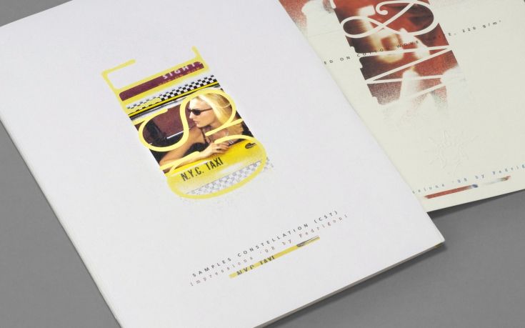
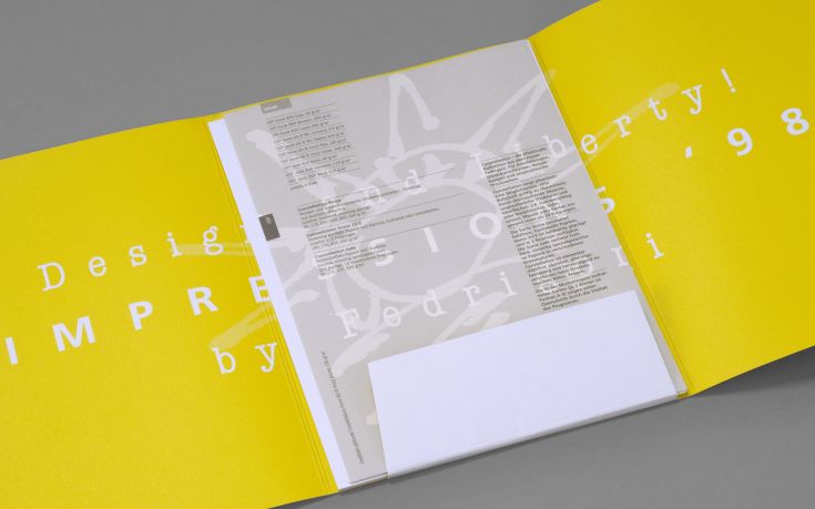
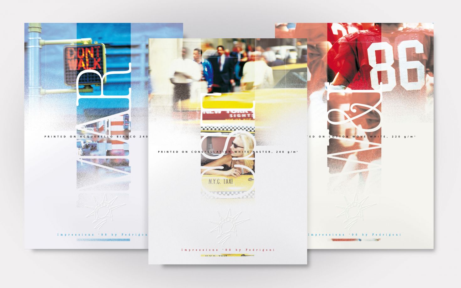
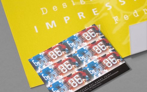
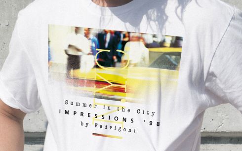
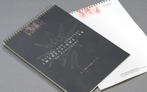
Photography: Frank M. Orel, Stuttgart
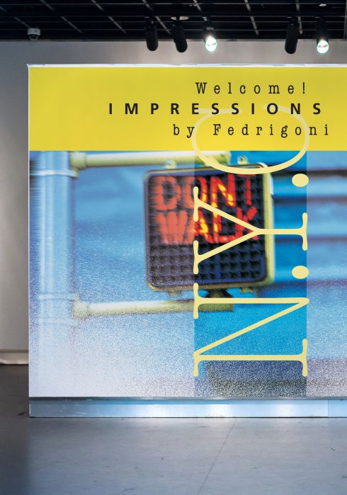
Impressions of New York City lifestyle for the launch of trendy fine papers. Vibrant colors, American Typewriter, a quick sketch of Miss Liberty—these candid snapshots of urban life are universally appealing. The lively campaign carries its momentum into sales promotion. We don’t trade the foil for the sledgehammer here; the refined style carries over to sample portfolios, promotional posters, sales materials for the field staff, and finely typographed price lists. The “Symbol” product bridges the transition to the Classics campaign.
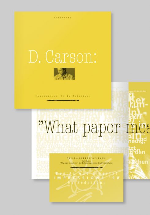
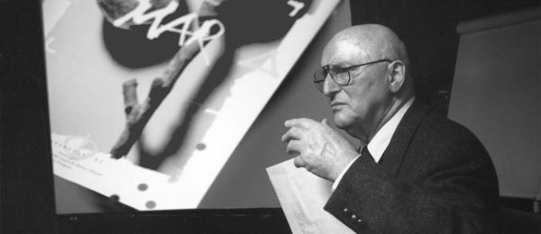
“What Paper Means to Me” – that is the title of the closing lecture for the campaign, delivered by David Carson, who at the time was the hottest designer alongside Neville Brody. See also the blog post The End of Print
Corporate Identity (Auszüge aus der Strategieskizze)
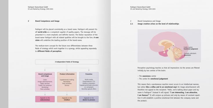
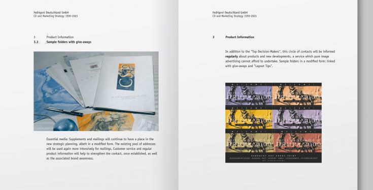
Fedrigoni has always been open to multifaceted communication design. The concept mentioned above, with its strong emotional appeal, is successfully applied across all campaigns. The analysis is clearly outlined and thoroughly justified in advance in the strategy manual. Short quote from the text: “Perceptual psychology teaches us that all sensory impressions are pre-filtered by two centers of the brain: the center of attention and the center of emotional evaluation. A spontaneous reaction is therefore never intellectual, but rather reflexive and emotional!” – We are grateful to be able to provide practical proof of this insightful finding through our concepts!
Learn more about corporate communication and brand building in the Exposé Corporate Design.