calligraphy & the art of writing
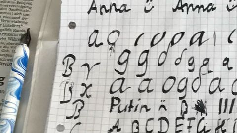
Calligraphy is the origin of all writing. Learning the art of calligraphy through the craft of writing with a quill pen fosters an understanding of good design across the entire field of typography.
Tutorials (password-protected area) © 1991-2026 Helmut Egerer, Munich
“Writing, Illuminating and Lettering”
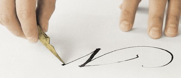
The book by British author Edward Johnston, published in 1908, became the definitive bible of calligraphy. His German student, Anna Simons, translated the work and published it two years later in Leipzig under the title “Schreibschrift, Zierschrift und angewandte Schrift” (Cursive, Ornamental, and Applied Script).
As students, we only know the book by hearsay; we never actually see it. Which isn’t necessary for the time being, since our master of type design is himself an outstanding writer, has a certain English air about him, and conveys the classical art of writing in Johnston’s manner like no other. Professor Lubahn, incidentally, never uses the term “calligraphy” himself; he doesn’t like the word. Perhaps it’s too folkloric for him, too mainstream. His world is the classical era; his Ten Commandments are carved in Roman type on Trajan’s Column. Be that as it may – the Roman style suits us well and sticks with us Trier alumni. We can say that with pride.
Learning to Write
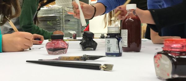
The path to good handwriting can be approached through both typography and calligraphy. Engaging with the classical art of writing tends to be an intuitive process. When the tool is used correctly, the movement naturally produces the organically correct form. Compared to pure typography, however, calligraphy always carries the risk of clumsy exaggeration. Despite the joy of a pleasing result, what matters most is how seriously one pursues the craft. Ultimately, a respectable level of skill can only be achieved through disciplined, self-critical practice using high-quality models.
Some time ago, the Augsburg-based "Augustus Verlag" (publishing house) offered me the opportunity to organize my own methodological ideas. Starting from classical letterforms, my textbook titled “Schreibschriften” ultimately explores expressive approaches that can also be applied in commercial design.
The following are excerpts from the book *Schreibschriften – Artistic Calligraphy for Beginners* …
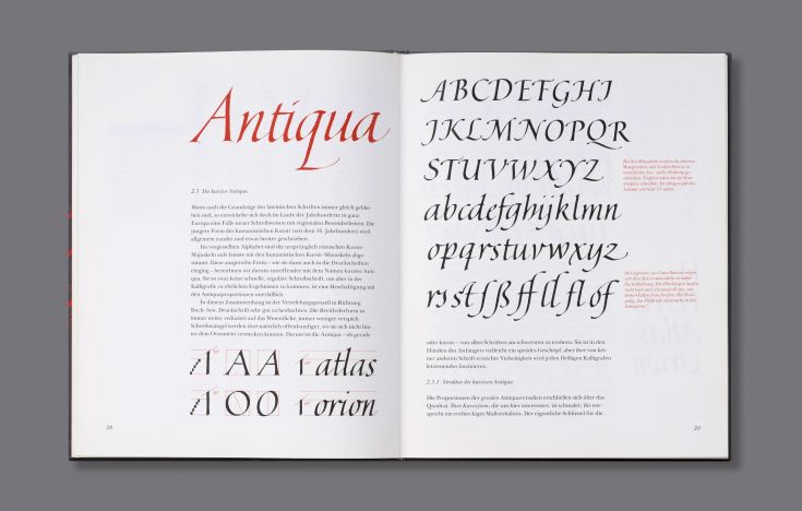
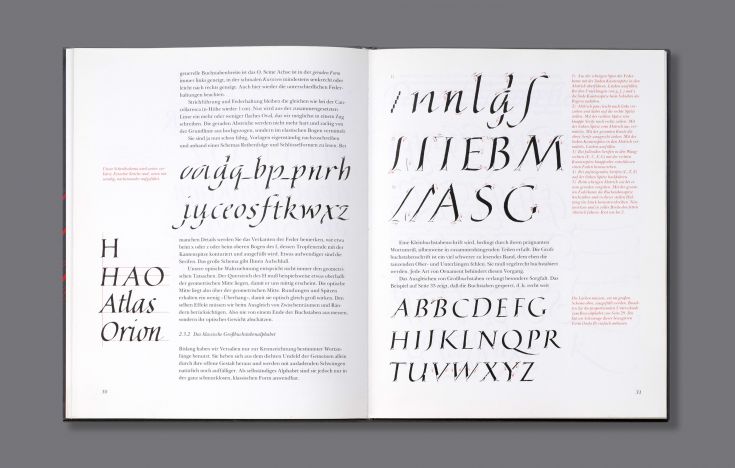
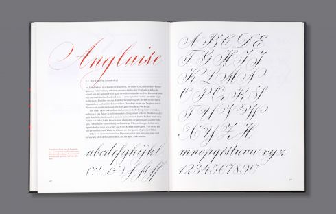
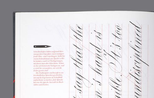
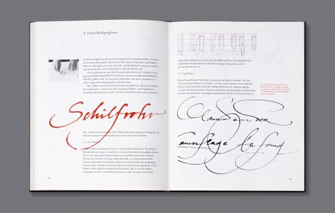
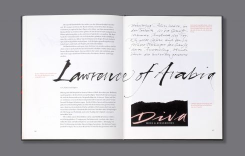
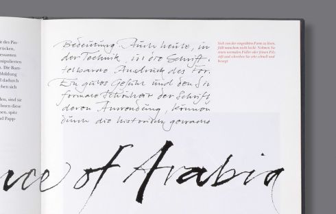
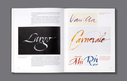
Artistic Calligraphy – A Textbook
This book project offers ideal conditions, because not only can I, as the author and calligrapher, contribute one hundred percent, but the publisher has also entrusted us with the layout – within certain guidelines – a true stroke of luck!
Now that I’ve resumed teaching, I’m happy to refer back to this book, which I still consider a success. Especially when I see firsthand how well the methodology and didactic choices still work to inspire young people interested in design to engage with the subject of type. The spectrum ranges from humanistic cursive, through elegant Roman type, and capricious English cursive, all the way to free improvisation: a tentative foreshadowing of what is currently causing a sensation in street art as “calligraffiti.”
The book was successfully published by the publisher twice in a row, sold out quickly, and then discontinued. However, it is still available through used bookstores or online (see below).
From the blurb: “Cursive scripts – decorative and artistic – are more than what is taught in school. They are fascinating for their fluidity and elegance and, by their very nature, are always written quickly and fluidly. Their character is largely shaped by the writing tool: be it the classic broad nib, the pointed nib, or unusual tools – some of which can be made by hand – such as various brushes, reed and bamboo nibs, or simple pieces of wood cut to size for writing.”
Handwriting is making a comeback, especially among a generation that has first thoroughly explored digital media.
Calligraphy + Typography
In contemporary communication design, handwritten text should be used with caution. Only freehand calligraphy serves an aesthetic purpose. Calligraphy either remains a distinct art form in its classical form or, through spontaneous gestures, seeks to create a deliberate contrast to structured typography.

This is what these rare cases are all about. Calligraphic lettering can still be a real eye-catcher – whether as a logo, a tagline, or a headline on printed materials or online. The whole thing is based on the compositional principle of “disturbed calm,” where the “extravagances” in the typography’s gray scale stand out particularly strikingly. Added to this is the lively expression, which naturally appeals to emotions much more intensely than neutral block letters ever could. The key point: it must fit the theme, and it must be truly excellent. A colleague once aptly compared the role of calligraphy to ballet. It must never become too theatrical, and certainly must not stumble.
Only those who have mastered this art will even consider using it. Opportunities to do so certainly exist and offer the client a distinct point of differentiation. Digital simulations are technically possible, but they are merely fakes, not art; moreover, the repetitive individual forms make it easy to tell whether a human wrote it or an algorithm conjured it up.
The following examples for the Italian fine paper manufacturer Fedrigoni showcase the pen nib in a spontaneous style, serving as the central key visual for the “PaperCult” campaign. (see portfolio)
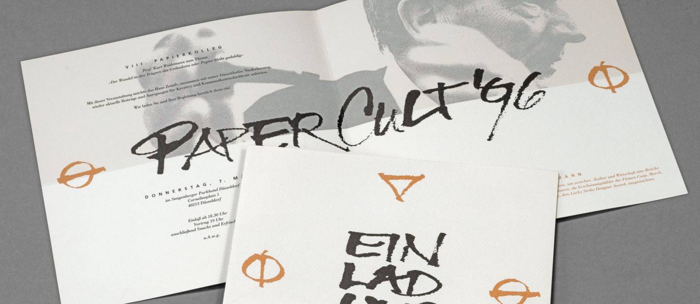
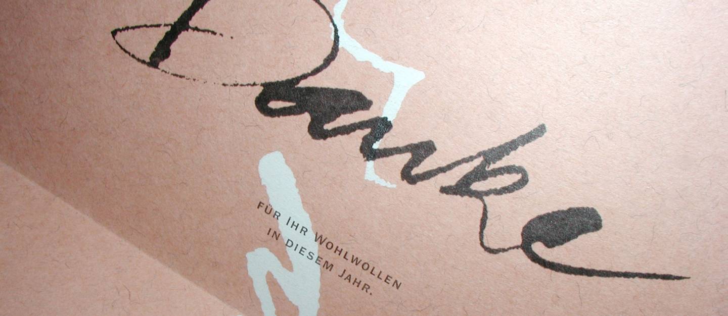
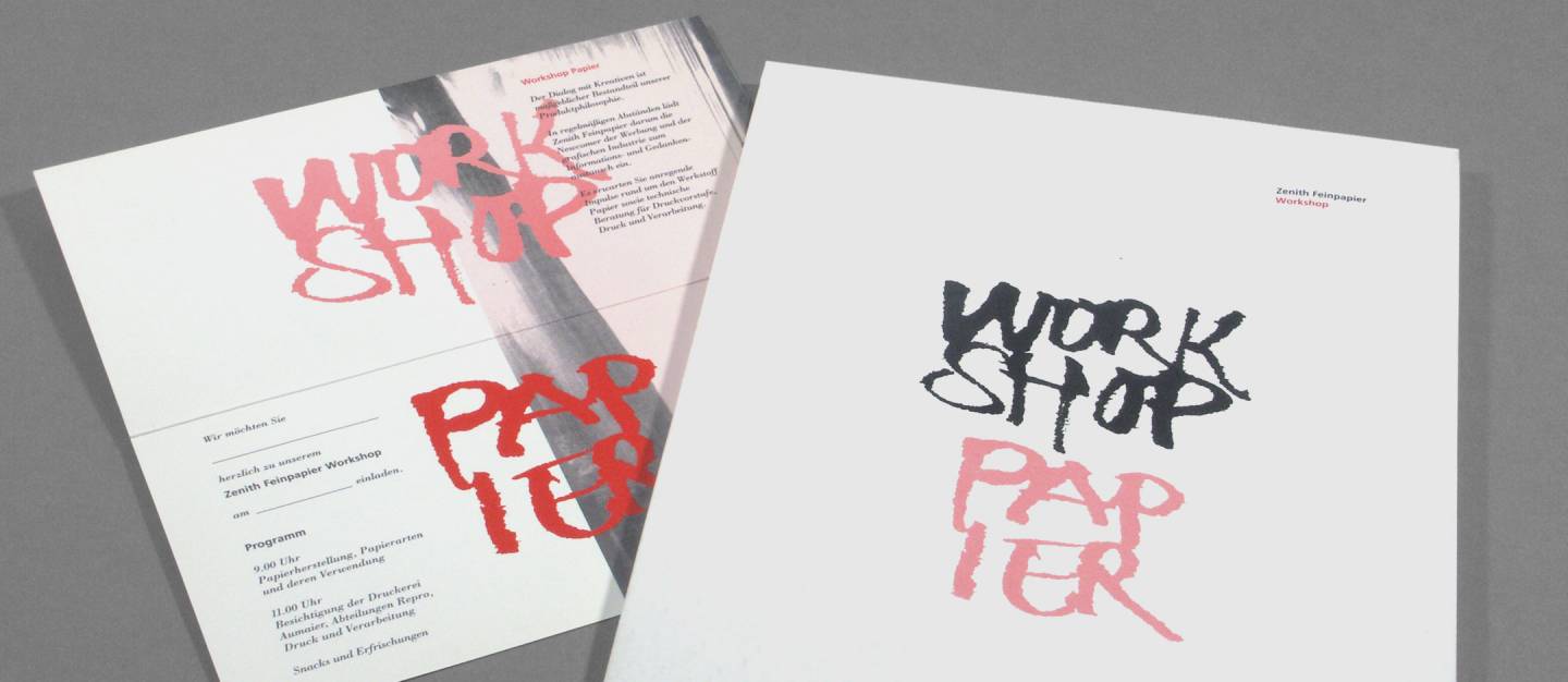
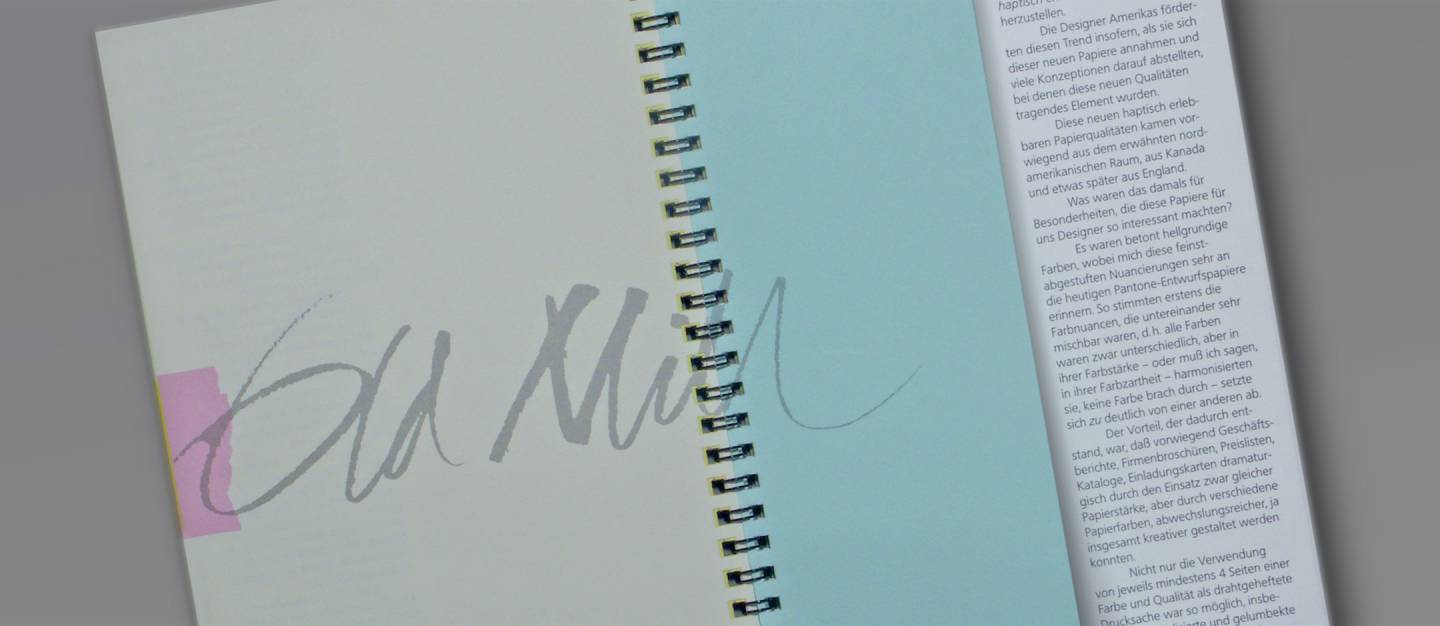
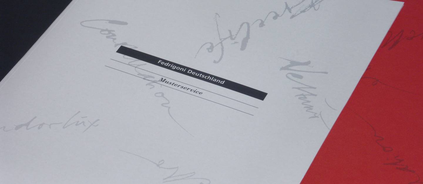
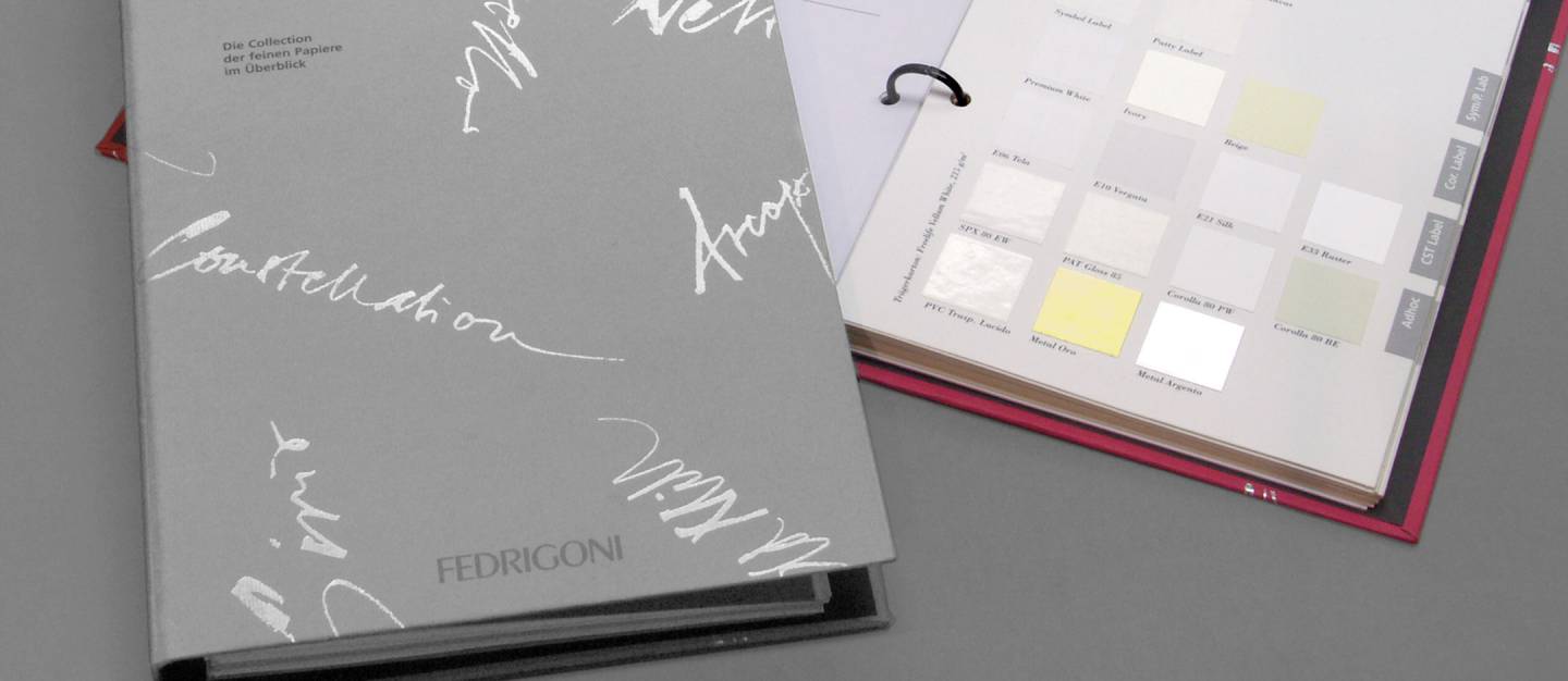
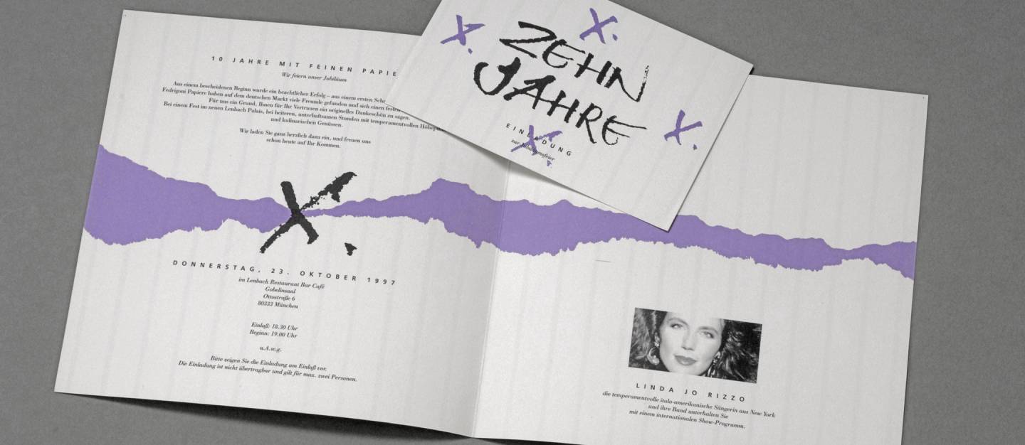
The slider displays print samples from the promotional campaign for Cartiere Fedrigoni in Verona. Lettering done with a nib pen and ink.
Classes + Methodology
Calligraphy instruction at the Munich Montessori High School (MOS) typically begins with a 2- to 3-day introduction to calligraphy. That is an extremely short period of time, which is precisely why the results are so remarkable.
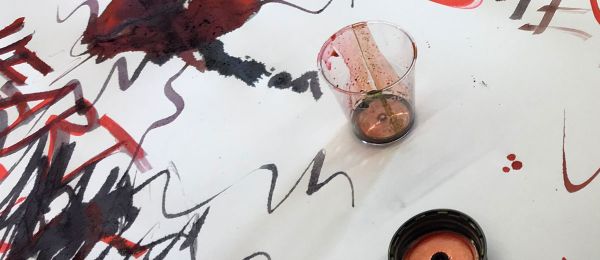
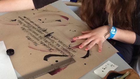
The aesthetic reference point and starting point is the Humanist cursive script of the early Italian Renaissance; practicing this style also helps cultivate one’s own handwriting. The following digression clearly illustrates how this works. The reproduction of precise letter forms is followed by free improvisation. On a larger scale and using rustic tools, we explore random writing traces and effects. Drawing on the international tradition of calligraffiti, we also touch on the Fraktur alphabet, while critically examining its historical context.
The examples below are works by an 11th-grade class on the second day! The echoes of the cursive style, which had previously been practiced only briefly, are still clearly recognizable in this free play. Yet the whole thing has a completely different “drive.” Movement and rhythm must be actively demanded. The fun of “action painting” plays an important role. Some discover for the first time the joy of the ink-splattering gesture.
This is so very different from how one learned it oneself – but perhaps is exactly what one would have wished for! Brevity is the soul of wit. The calligraphic preliminary stage serves as preparation for further instruction in typography and poster design.
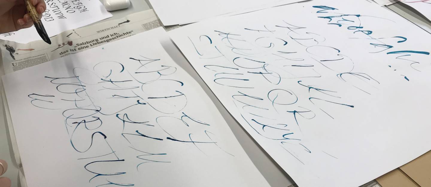
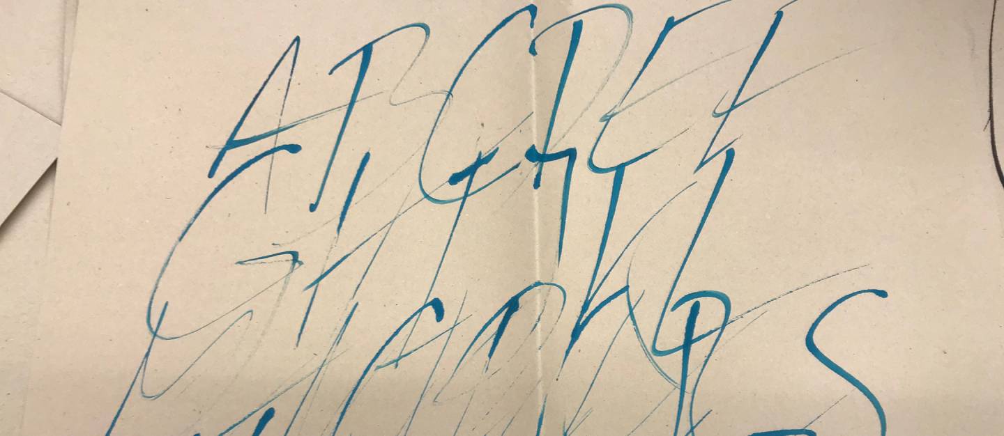
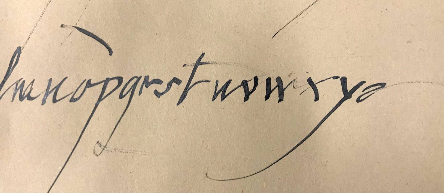
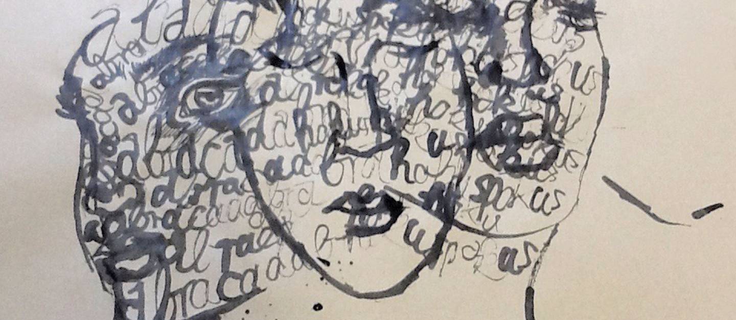
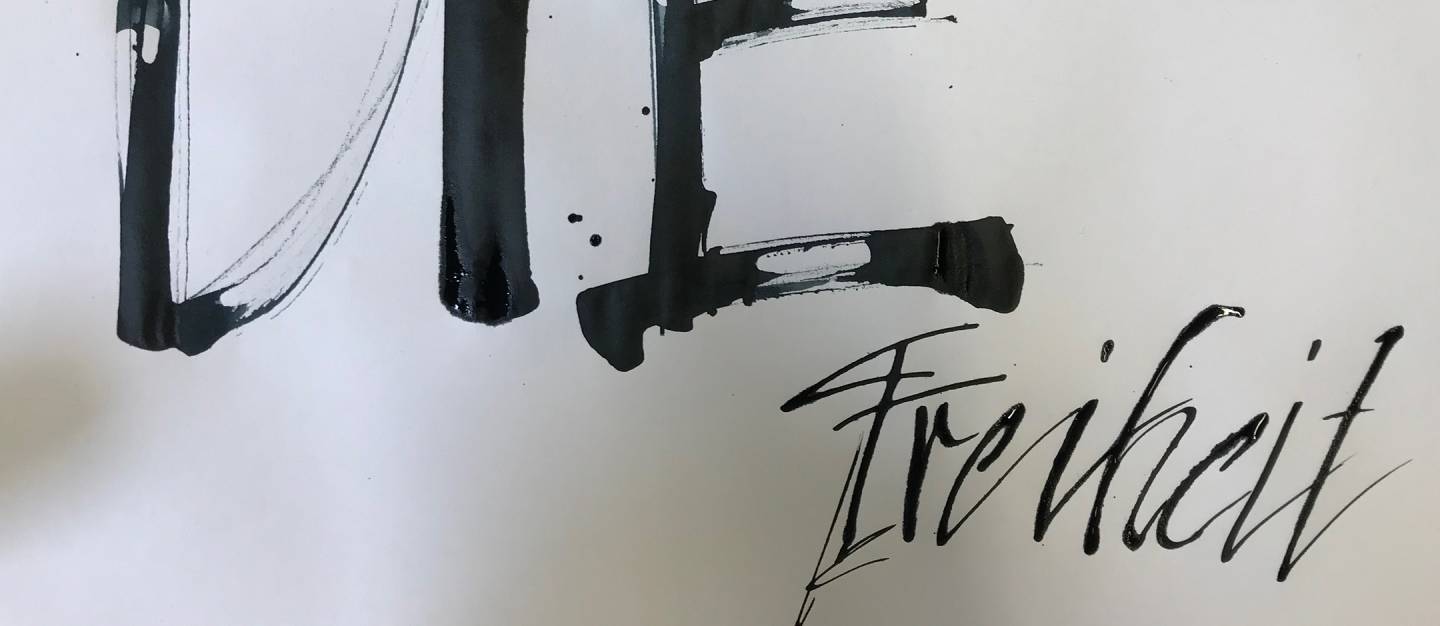
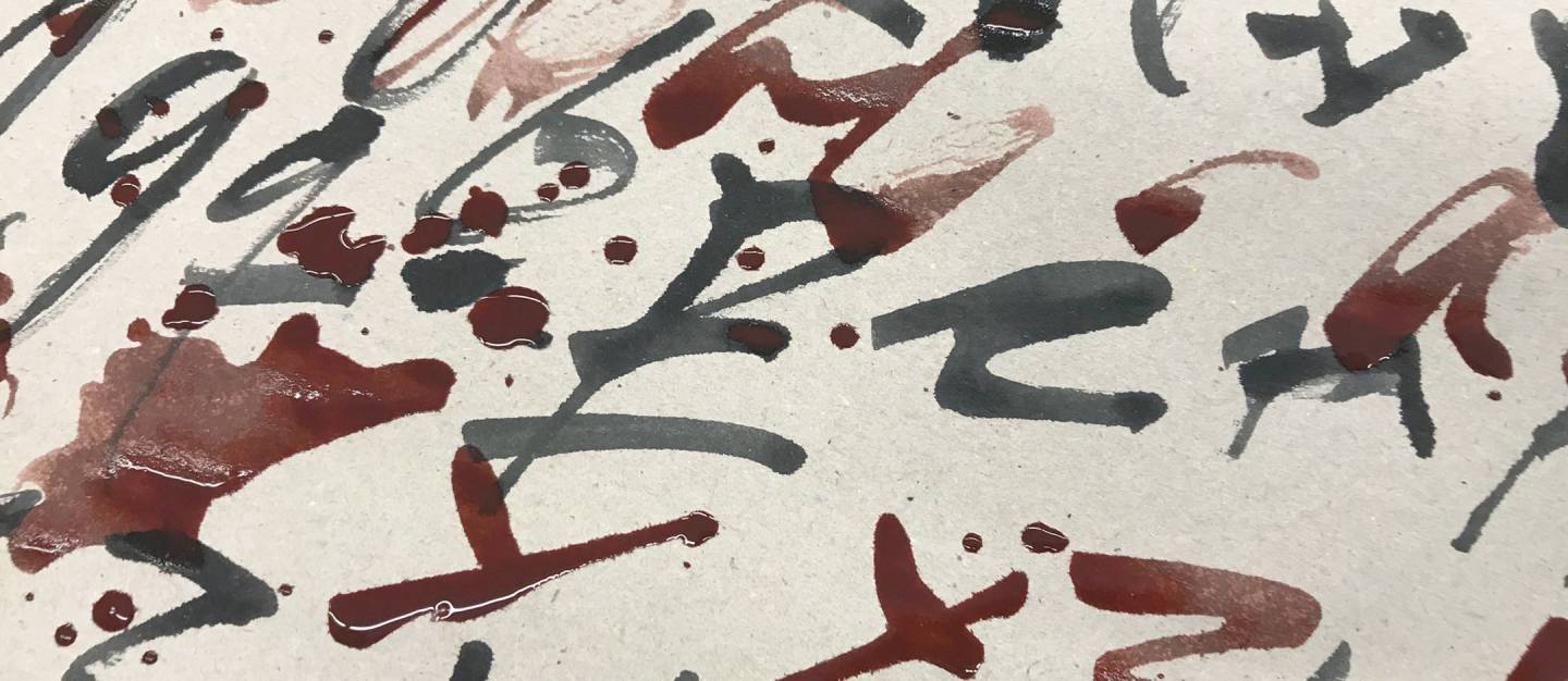
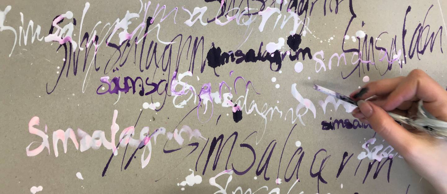
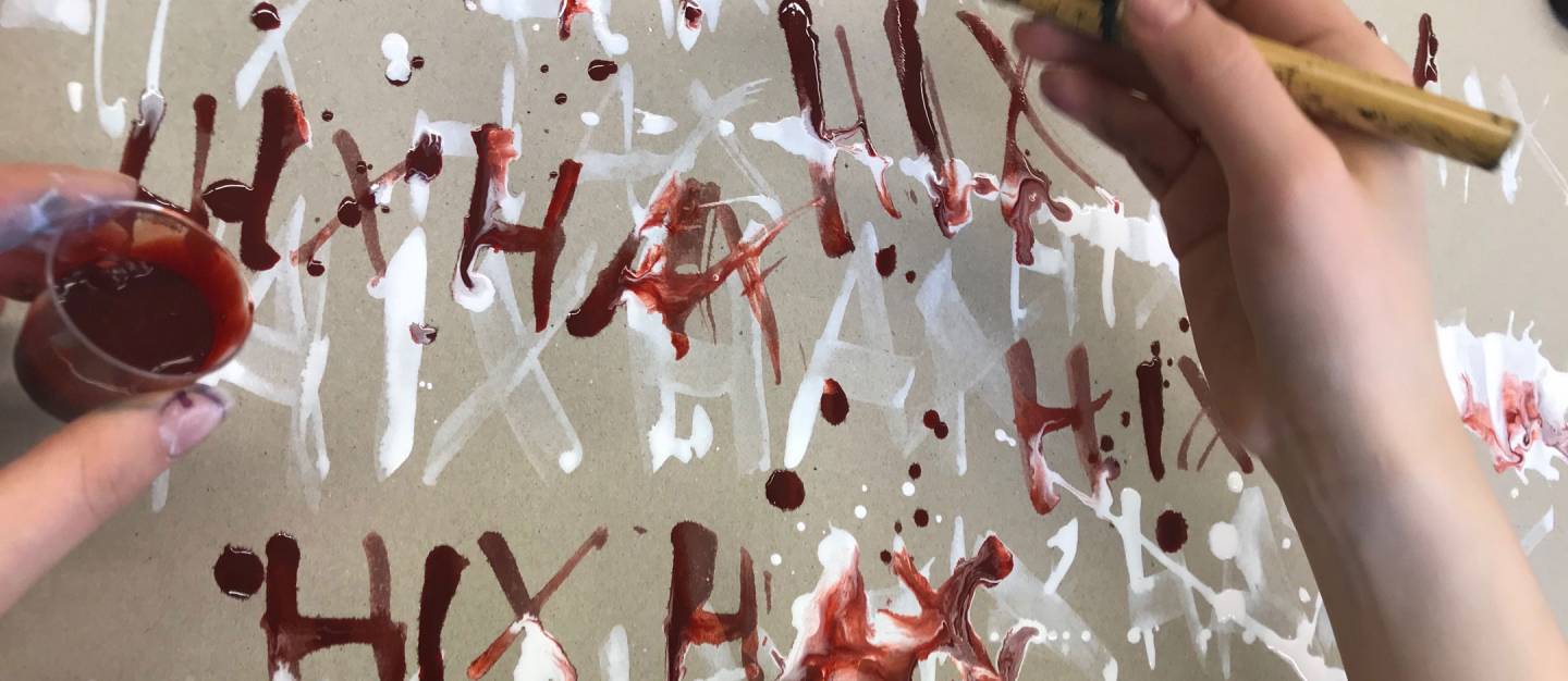
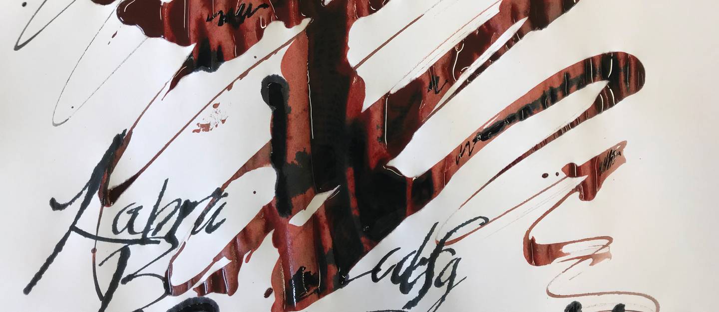
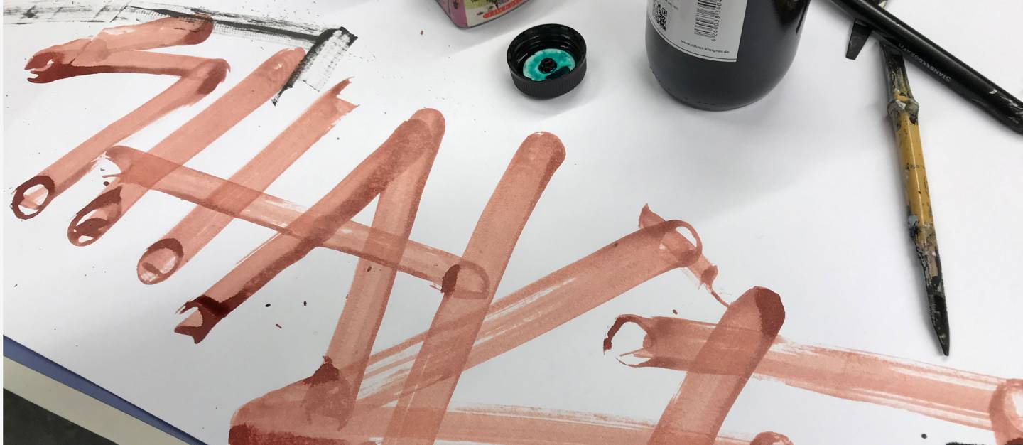
Student work from the course “Fundamentals of Typography – Type and Posters” – experimental introductory phase. Read more in the blog post

Teaching Assignments and Textbook
- Winter Semester 1988-1989 · University of Essen (Folkwang School) · Teaching assignment in typography
- 1990-1991 · Vocational School for Graphic Design and Advertising (now: Alois Senefelder Vocational School Center), Munich · Teaching assignment in typography
- 1996-1998 · DiZ, Center for University Didactics, Kempten · Typography seminars
- Since 2012 · Montessori Technical High School, Munich, Design Department · Lecturer for workshop on type and posters
Textbook on artistic calligraphy
- Helmut Egerer, Cursive Scripts, Textbook, 84 pages · ISBN 3-8043-0169-X
- Workbook, 32 pages · ISBN 3-8043-0184-3